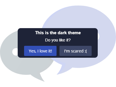
Notifications and Dialogs
on your Website

ToastmeJS is a very simple, flexible and light weigth plugin that shows Notifications and modal Dialogs on your website with vanilla javascript!

DOWNLOAD

Installation

Toastme does not have any dependencies. Just run next command via NPM

$ npm install toastmejs

Then import toastme

import {toastme} from 'toastmejs'

or
  
const toastme = require('toastmejs')

Via CDN

Import the CSS via a <link /> and <scripts /> elements:

<link rel="stylesheet" href="https://unpkg.com/toastmejs@latest/dist/css/toastme.css">
<script src="https://unpkg.com/toastmejs@latest/dist/js/toastme.min.js"></script>

Download

Or simply download it and include necesary CSS/JS files to your project.
Notifications

With toastme you can mantain your users informed about any actions they or your webapp is doing. It's really easy to use.

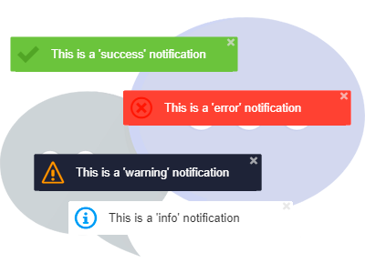
You can show all common web notification types:

  • Success
  • Danger
  • Warning
  • Info
  • Default

How to use it?

Once you have imported toastmejs, you can call its methods like this:

toastme.default("This is a 'default' notification")

toastme.success("This is a 'success' notification")

toastme.error("This is an 'error' notification")

toastme.warning("This is a 'warning' notification")

toastme.info("This is an 'info' notification")
Notifications

Notification demos

Want to see some examples? Click next buttons to make it work!

Default theme

Ligh theme

Dark theme

Notification Example
//Customize your Notification  
const config = {
    timeout: 5000,
    positionY: "bottom", // top or bottom
    positionX: "center", // right left, center
    distanceY: 20, // Integer value
    distanceX: 20, // Integer value
    zIndex: 100, // Integer value
    theme: "default", // default, ligh or  dark (leave empty for "default" theme)
    duplicates: false // true or false - by default it's false
};

//Create a new Toastmejs class instance
const mytoast = new Toastme(config);

//Call it whenever you want!
mytoast.success("Hello, this is my custom notification!");

Customizable!

You can customize duration, position, distance, z-overlapping and a theme

  1. timeout: miliseconds
  2. positionY: 'top' or 'bottom'
  3. positionX: 'left', 'right' or 'center' position
  4. distanceY: distance from the Y axis
  5. distanceX: distance from the X axis
  6. zIndex: overlapping order
  7. theme: default, ligh or dark (leave empty for "default" theme)
  8. duplicates: set this 'true' or 'false' - by default it's false

Dialogs

Notifications are not enough so I added some modal Dialogs to toastme. Now you can show custom confirmation boxes, messages, alerts, etc.

Also, you can show modal types and themes!

  • Success
  • Danger
  • Warning
  • Info
  • Question
Dialogs

Dialog demos

Want to see some examples? Click next buttons to make it work!

Dialog Example
//Example
toastme.yesNoDialog({
    title: "You are the Winner!",
    text: "Do you want to pick your price?",
    textConfirm: "Confirm",
    textCancel: "Cancel", 
    showCancel: true, // true or false
    type: "success", // 'success', 'danger', 'warning', 'info' or 'question'
    dark: false, // Show dark theme? 'true' or 'false'
}).then(function(value) {
    if (value) {
        console.log('You clicked Confirm')
    } else {
        console.log('You clicked Cancel')
    }
});

Customizable!

You can customize your toastme dialog too!

  1. title: dialog title
  2. text: dialog text
  3. textConfirm: confirm button caption
  4. textCancel: cancel button caption
  5. showCancel: Show cancel button? 'true' or 'false'
  6. type: select 'success', 'danger', 'warning', 'info' or 'question'
  7. dark: Show dark theme? 'true' or 'false'